Close your eyes and imagine the bright red of Coca-Cola, the calm blue of Facebook, or the cheerful yellow of McDonald's arches.
Even without seeing the logos, you feel what these brands stand for — energy, trust, happiness.
That's not coincidence. That's the psychology of colour at work — one of the most powerful yet underrated forces in brand design.
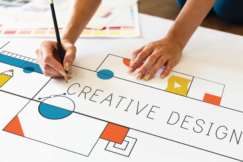
At Kusum Innovations, we know that colours don't just decorate a design — they define it. Every hue tells a story, every shade sets a tone, and every palette shapes how people perceive and connect with your brand.
Why Colour Matters in Branding
Your brand's colours are often the first thing people notice — and the last thing they forget.
In fact, studies show that up to 90% of snap judgments about a product can be based on colour alone.
Colours have the power to:
• Evoke emotions (calm, excitement, trust, luxury)
• Influence perception (budget vs. premium, playful vs. professional)
• Drive decisions (what people buy, click, or remember)
When used strategically, colour becomes more than an aesthetic choice — it becomes a psychological connection.
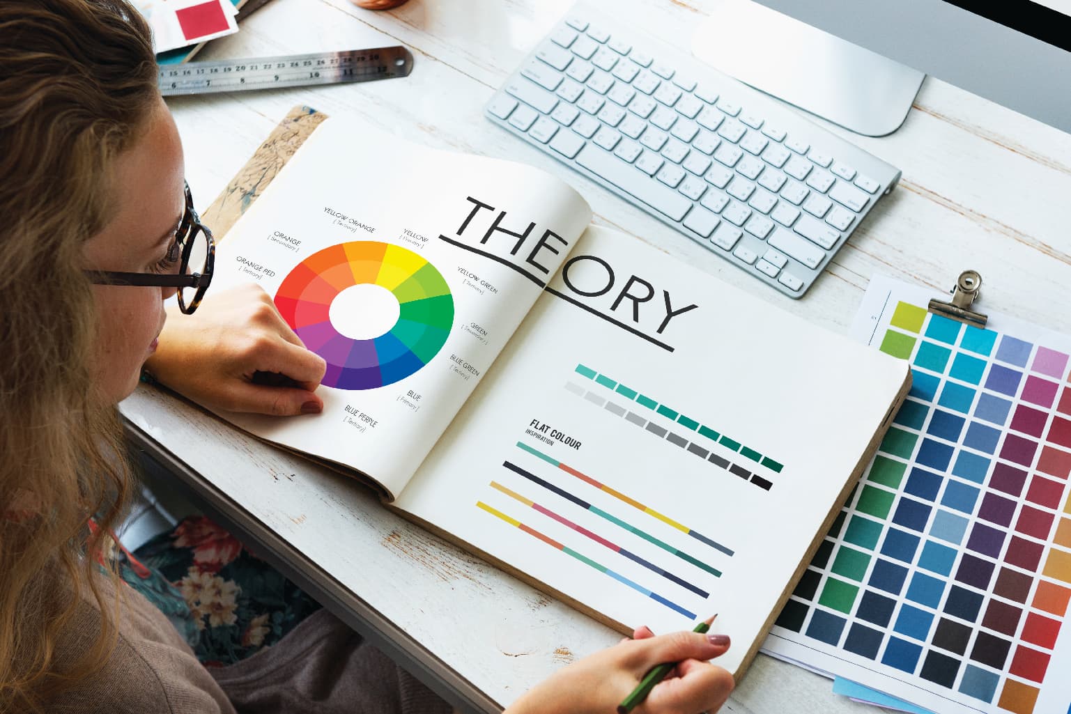
The Emotional Language of Colour
Let's decode what different colours say in design:
• Red – Passion, energy, urgency. Perfect for brands that want to excite or inspire action.
• Blue – Trust, stability, calm. The go-to for tech, healthcare, and corporate brands.
• Yellow – Optimism, warmth, creativity. Often used by brands that radiate positivity.
• Green – Growth, health, balance. Ideal for eco-friendly, wellness, and financial brands.
• Black – Sophistication, authority, luxury. A timeless choice for premium and fashion labels.
• Purple – Creativity, wisdom, imagination. Favoured by brands that blend art with innovation.
• Orange – Friendliness, enthusiasm, approachability. Great for lifestyle and entertainment brands.
At Kusum Innovations, we don't just pick colours that look good — we choose colours that feel right for your story.
The Science Behind the Emotion
Colour psychology works because it taps directly into our subconscious.
We associate colours with experiences and emotions without even realizing it.
For instance, a deep blue might remind someone of calm ocean waves, while bright red might spark adrenaline — all within seconds.
That's why consistent and thoughtful use of colour across your logo, website, packaging, and marketing materials can create a powerful sense of familiarity and trust.
Building a Colour Strategy That Reflects You
At Kusum Innovations, our design process starts with one question:
What do you want people to feel when they see your brand?
From there, we develop a colour palette that reflects your brand personality, target audience, and industry tone.
• Start with your brand's core emotion.
Are you empowering, playful, elegant, or bold?
• Use contrast wisely.
It grabs attention and improves readability.
• Stay consistent.
Your brand colours should stay cohesive across all touchpoints.
Colour is a silent ambassador for your brand — and when chosen right, it speaks volumes.
Paint Your Brand Story with Kusum Innovations
In the end, great design isn't just about how it looks — it's about how it makes people feel.
And nothing influences feeling more than colour.
At Kusum Innovations, we blend design psychology, strategy, and creativity to craft brand identities that connect instantly and last forever.
Let's give your brand a colour palette that speaks its true language.
Partner with Kusum Innovations to design visuals that inspire trust, emotion, and action.
Reach out today — and let's colour your brand with purpose.